Simple animated tab bar in React Native
A quick demonstration of a sliding tab bar animation using React Native and Reanimated 2
I am a senior software developer at Estendio, mainly working in React Native with Typescript, as well as a sprinkling of web dev using React and PHP.
I was looking to build this form designed by pixelz-studio where a user can select to log in either by email or phone number by selecting a button, styled like a tab. I liked the idea of animating the tab selection so that the tab would appear to slide across to whichever button was selected.
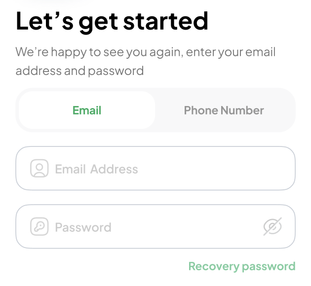
Demo
You can try out this code here using Expo Snack
Basic component structure
The tab bar consists of 3 main views:
Background container
Animated sliding section
Container for the row of buttons
For this method to work, the tab buttons need to be all the same width. I chose to use RN's Pressable component, and they are each given flex-1 (I am using tailwind for styling in this project)
Calculating the size of the buttons
The animated sliding section needs to know the height and width of the buttons. For this, we need to measure the container of buttons using the view's onLayout method, which gives us the view's dimensions on render - which we can then store in state. We can then divide the total width of the container by the number of items in our tab bar, and this will be the button width.
Animating the sliding section
On each button press, we fire our function onTabPress(index). In this function, we take the index of the pressed tab and multiply it by the width of the button - this gives us the position on the X-axis that the tab needs to slide to.
We have stored the tabPositionX in a SharedValue from Reanimated. This can now be animated and set to the new position. We then apply this position to the UI, using the useAnimatedStyle hook to generate the animated translateX value which we pass as a style prop to the Animated.View.
The final step is to change the font colour for the selected tab. For this, we use the optional callback parameter from our withTiming animation to run a function on the Javascript thread, which in this case, simply sets the selectedTab in state. We can then check in the mapped array of buttons if the selected tab index is the same as the index, then style it.
Accessibility
Give the tab bar an accessibilityRole='tabbar' and each button has the role of tab. We also need to provide an accessibilityLabel as screen readers will not just use the button's text value like they would on the web. With these roles and labels in place, when users navigate to this component using VoiceOver or TalkBack, the tab bar is correctly labelled, and they are informed which tab they are currently selecting.
Code
Here is the completed component:
import {LayoutChangeEvent, Pressable, Text, View} from 'react-native';
import React, {FC, useState} from 'react';
import Animated, {
  runOnJS,
  useAnimatedStyle,
  useSharedValue,
  withTiming,
} from 'react-native-reanimated';
import tw from 'twrnc';

export interface TabButton {
  title: string;
  accessibilityLabel: string;
}

interface TabButtonsProps {
  buttons: TabButton[];
  selectedTab: number;
  setSelectedTab: (index: number) => void;
}

/**
 * An animated tab bar of buttons - when user selects a button, tab slides and style changes
 */
const TabButtons: FC<TabButtonsProps> = ({
  buttons,
  selectedTab,
  setSelectedTab,
}) => {
  const [dimensions, setDimensions] = useState({height: 20, width: 100});

  const buttonWidth = dimensions.width / buttons.length;

  const padding = 10;

  // this will keep track of the translationX value of our moving tab
  const tabPositionX = useSharedValue(0);

  // on view layout, we measure the width and height and
  // set in state so we know how far to move the tab
  const onTabbarLayout = (e: LayoutChangeEvent) => {
    setDimensions({
      width: e.nativeEvent.layout.width,
      height: e.nativeEvent.layout.height,
    });
  };

  // We can set a callback for any functionality that should fire once the animation is finished
  const handlePressCb = (index: number) => {
    setSelectedTab(index);
  };

  const onTabPress = (index: number) => {
    // animate the tab and fire callback
    tabPositionX.value = withTiming(buttonWidth * index, {}, () => {
      runOnJS(handlePressCb)(index);
    });
  };

  const animatedStyle = useAnimatedStyle(() => {
    // apply animated value to the style, moving the tab
    return {
      transform: [{translateX: tabPositionX.value}],
    };
  });

  return (
    <View
      accessibilityRole="tabbar"
      style={tw`bg-gray-100 rounded-xl justify-center`}
    >
      <Animated.View
        style={[
          animatedStyle,
          tw`bg-white rounded-lg mx-1 absolute`,
          {
            height: dimensions.height - padding,
            width: buttonWidth - padding,
          },
        ]}
      />
      <View onLayout={onTabbarLayout} style={[tw`flex-row`]}>
        {buttons.map((button, index) => {
          const color = selectedTab === index ? 'green-600' : 'gray-600';

          return (
            <Pressable
              key={index.toString()}
              accessibilityRole="tab"
              accessibilityLabel={button.accessibilityLabel}
              onPress={() => onTabPress(index)}
              style={tw`flex-1 py-4`}
            >
              <Text
                style={tw`text-gray-700 self-center font-semibold text-sm capitalize text-${color}`}
              >
                {button.title}
              </Text>
            </Pressable>
          );
        })}
      </View>
    </View>
  );
};

export default TabButtons;